
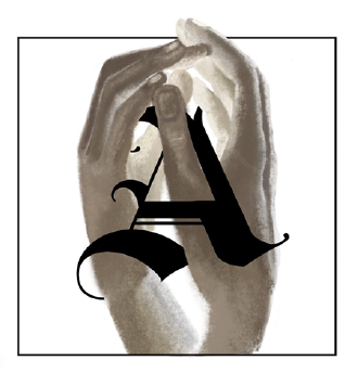
Initial Cap 1

Initial Cap 2

Initial Cap 3
Initial Cap 4
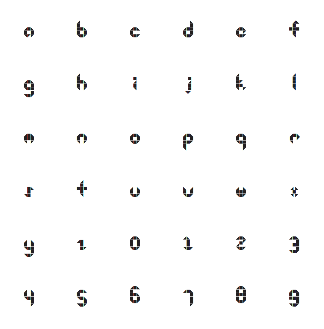
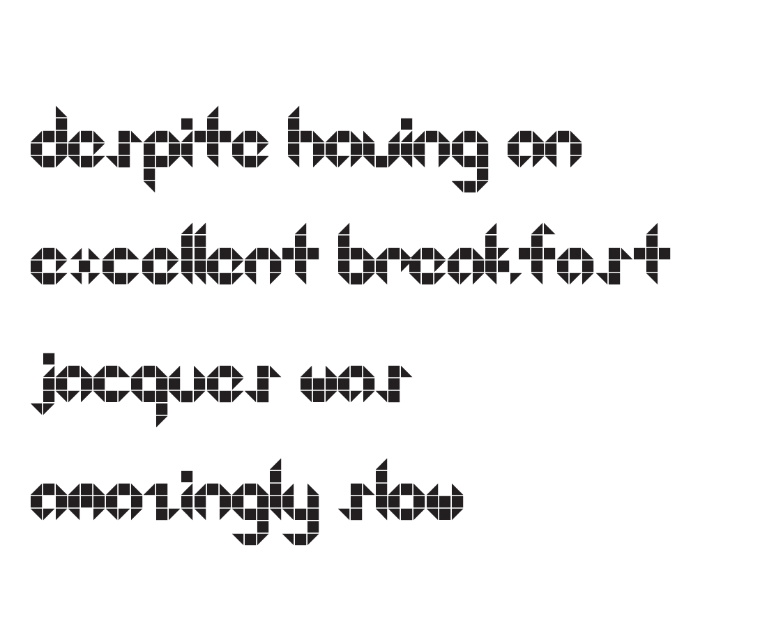

Typography plays such a large role in our every day life, so I think it is of high importance that we keep typography innovative and creative. The initial caps are hand drawn for a Romeo and Juliet book that I typeset. I drew inspiration from traditional initial caps, like those seen in Medieval manuscripts. I added my own twist by intertwining hand drawn elements within the letter. The programs used were Procreate and Adobe Photoshop. The last three images display a typeface I created in its entirety based upon a set of grids I drew. By studying kerning I was able to create a constructed script that pushes the boundaries of legibility. To further experiment with the typeface I created the last poster. It is an abstract spelling of "Squared Version 2," the name I had given the typeface. Programs used were Glyphs, Adobe Illustrator, and Adobe Photoshop.